I wanted to create a logo for BK42 that was simple, versatile, and easily recognizable, but also reflected the brand's values and identity.
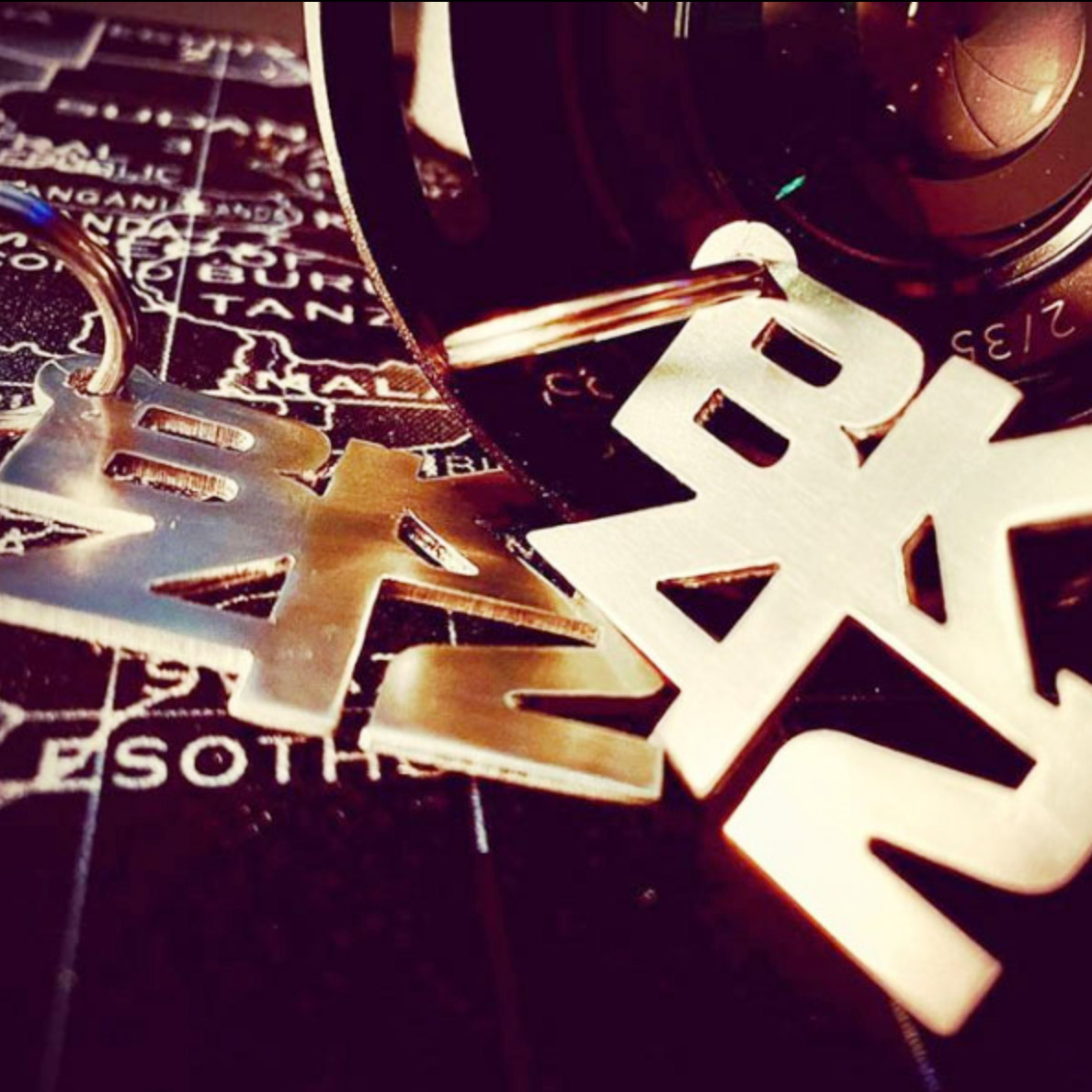
I started by considering the letters "BK" and the number "42". The letters "BK" could stand for "Bikes" and "Custom", and the number "42" is a reference to the BK42's first workshop address. I wanted to combine these elements in a way that was both creative and meaningful.
I decided to stack the letters "BK" on top of each other, with the "42" positioned to the right of the "K". This creates a sense of balance and symmetry, and it also makes the logo easy to read and remember. I chose a bold, sans-serif font for the logo, as I wanted it to be modern and impactful.
The logo is primarily black, but I also incorporated a subtle yellow accent. Yellow is a color that is often associated with energy, creativity, and innovation. It is also a color that is frequently used in the cycling industry. I wanted to use yellow in the logo to convey BK42's passion for custom bikes and its commitment to innovation.
I am very pleased with the final design of the BK42 logo. I believe that it is a simple, versatile, and easily recognizable design that accurately reflects the brand's values and identity.